LOCK ELECTRICAL
BRIEF
Lock Electrical were a relatively new venture when they approached us to develop their brand.
They wanted something that was organised and helped build their reputation.
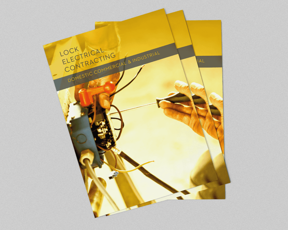
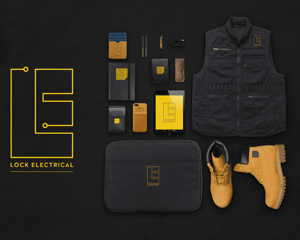
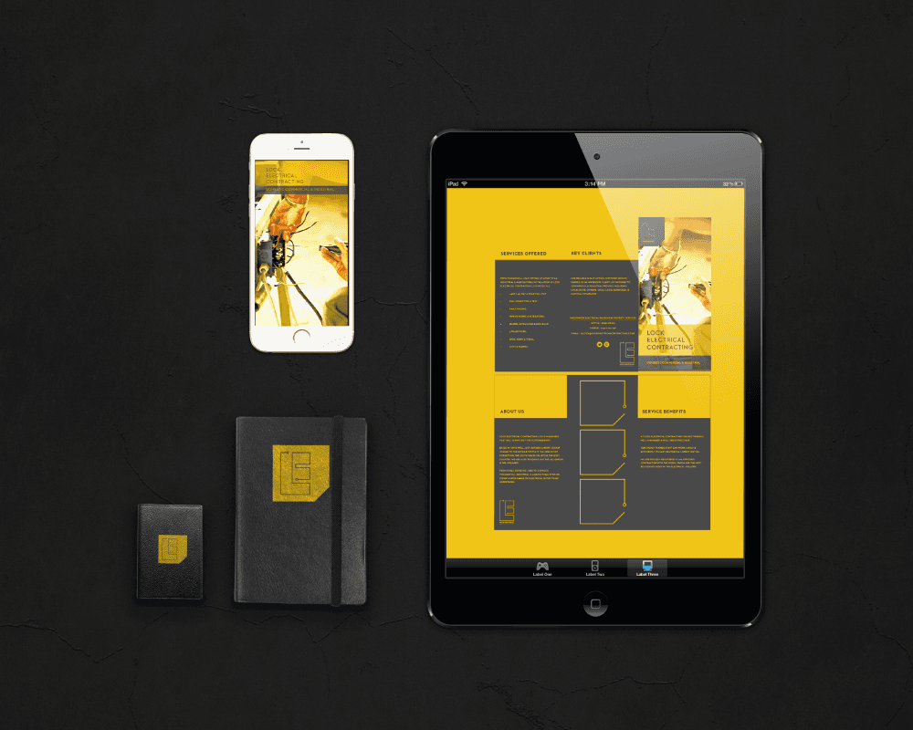
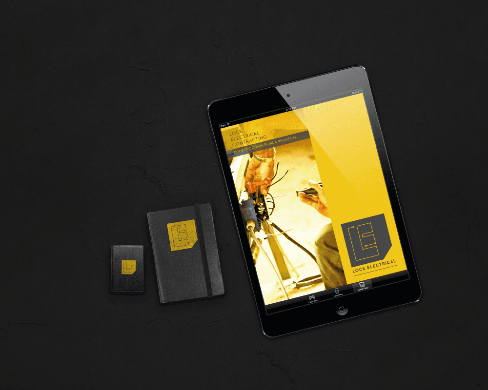
The initial stages included designing a brand for stationery, clothing and signage.
SOLUTION
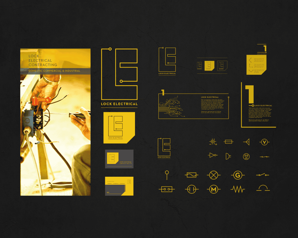
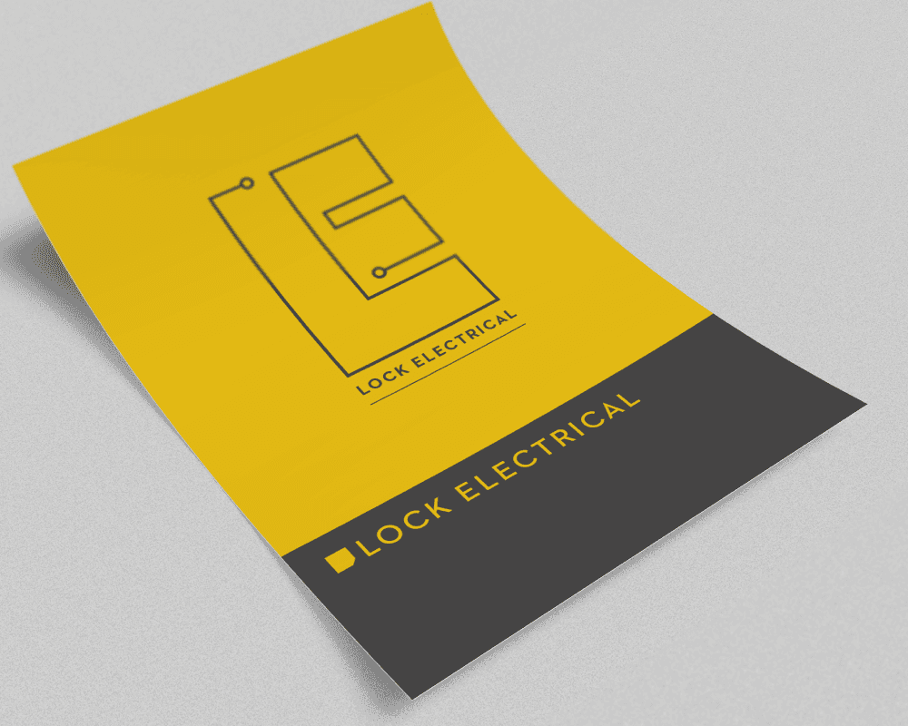
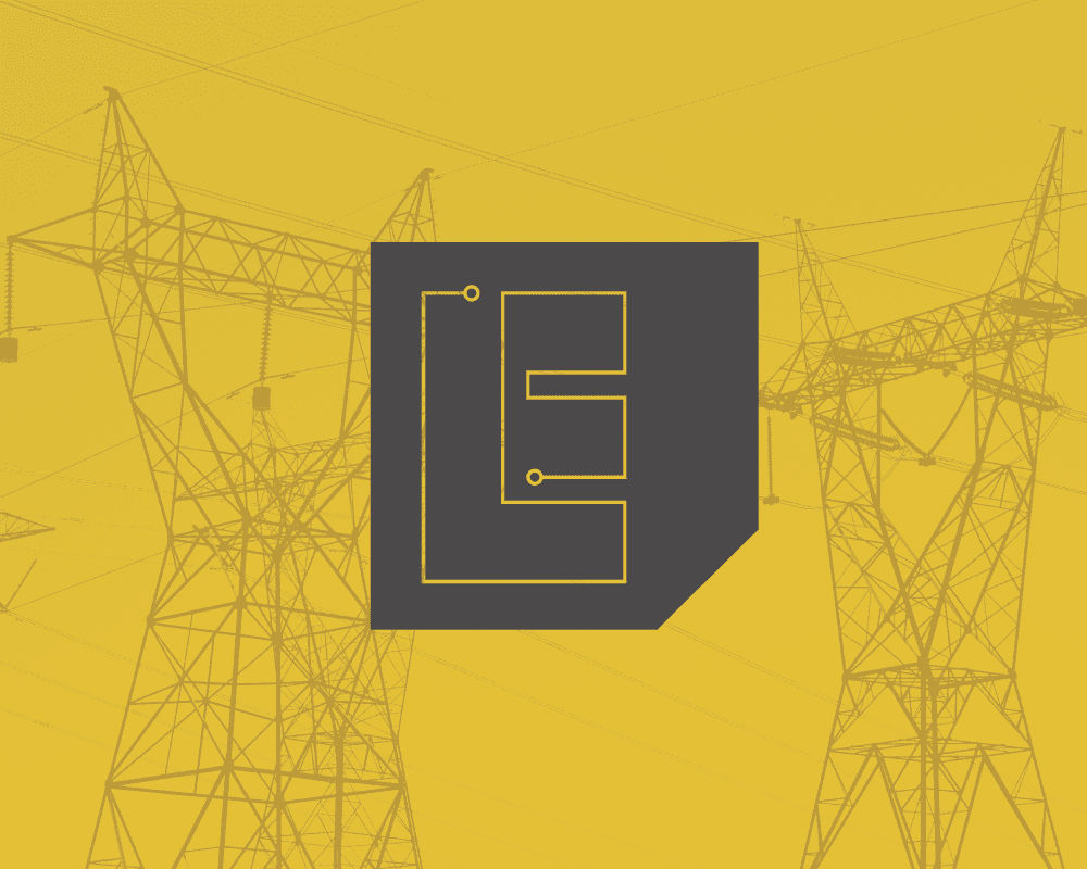
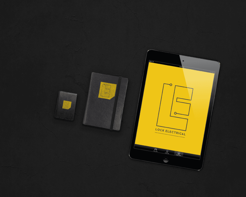
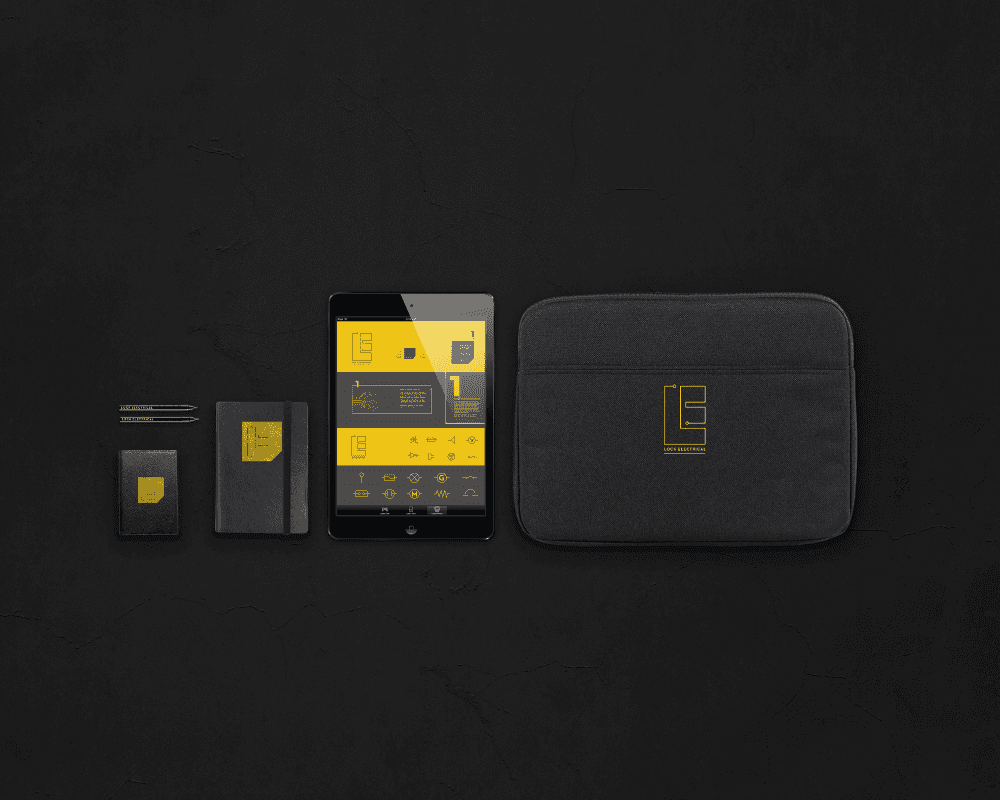
Tonally we knew very early on that we wanted to use a warm yellow and dark grey to represent the industry that Lock Electrical are associated with.
The main focus of the logo mark was to use an unbroken line representative of a circuit; this was then developed into the shape of a combined L & E.
The logo can also be used in a more restricted crest format, which is inspired by a digital chip. This application is mainly for clothing to support the fine lines of the primary brand.
Finally we created a micro guideline outlining icons, photo usage and typographic elements.